
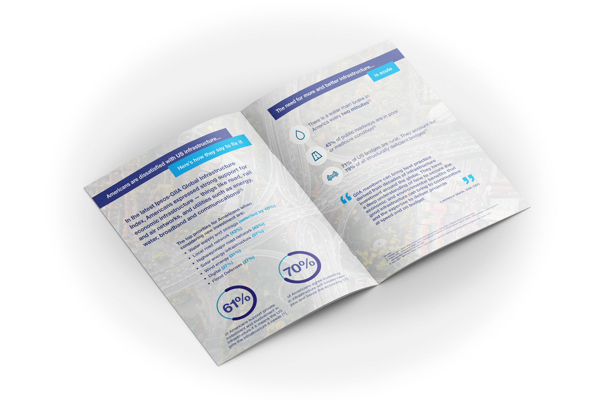
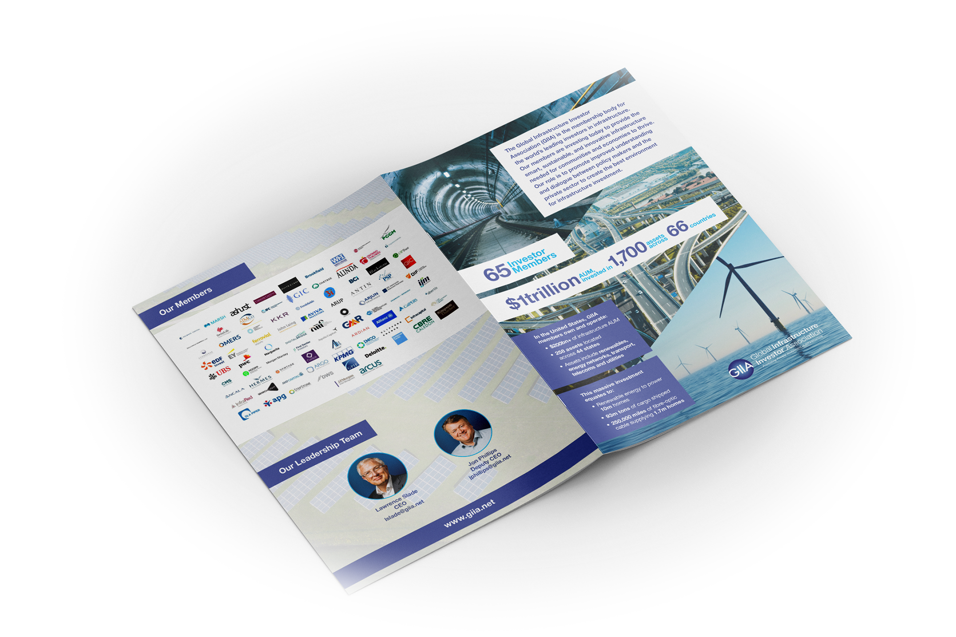
Global Infrastructure Investor Association
This leave-behind brochure was designed ahead of high-level meetings representatives of the GIIA were having with key stakeholders in the United States. It outlines the organisation's reach and key infrastructure statistics, as well as results of their previously commissioned poll; all while using engaging imagery, pull out quotes and block use of the brand colour palette to create an engaging and eye-catching document that connects with their audience.


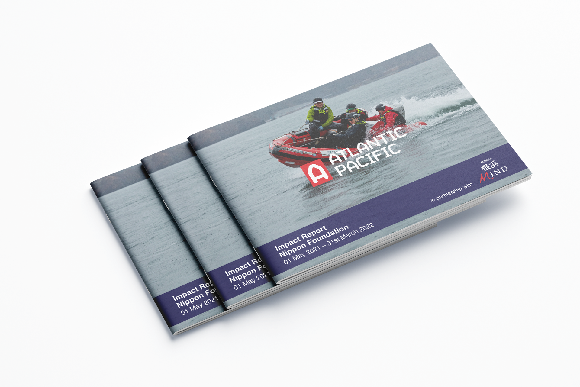
Atlantic Pacific
Sea safety and lifeboat training charity Atlantic Pacific required an Impact Report for a key funder, to be designed in both English and Japanese. The reported needed to be engaging and clearly show the success of their support, all while meeting a tight deadline for the external organisation. The two reports designed are aligned to the organisation’s brand guidelines and use eye-catching and emotive photography, as well as a bold style to highlight key statistics, which brings to life the activities the client undertook and demonstrating value for money.


West Side Stories – Article
The layout design for this article on travelling in West Africa, in an imagined TimeOut travel magazine uses a simple typeface and two-tone image treatment, as well as an asymmetrical layout to convey authenticity through a handmade quality, while the consistent style in the copy and pull out quotes guide the reader, and the negative space allows the article to breathe and be absorbed easily.


