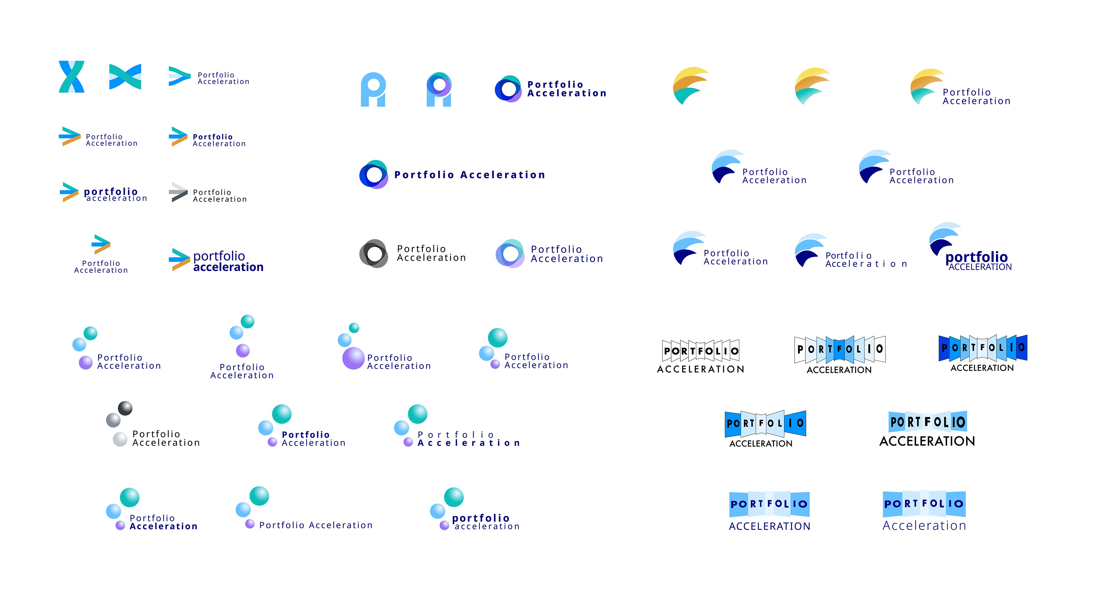
Portfolio Acceleration
This logo developed for a new marketing team within global pharmaceutical firm Pfizer serves to subtly represent the previous three teams that formed the new Portfolio Acceleration team. The identity emphasises the team's speed and agility, as well as representing a stylised portfolio. This new internal brand allows a more efficient process for engaging customers, health professionals and patients together, and improved communications across internal teams.

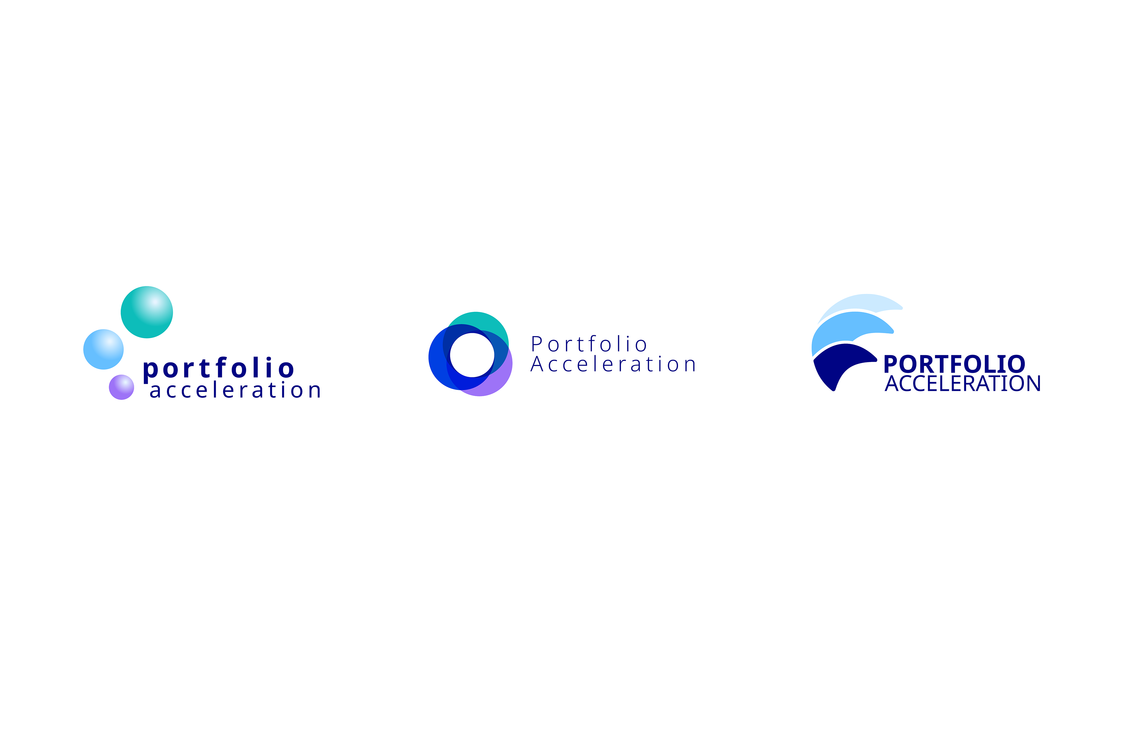
These three logos were the others presented to Pfizer for the Portfolio Acceleration team identity, all representing the three teams coming together to form the single entity, and using the brand's colour palette.


Takeda Leadership Behaviours
These glyphs were developed for global pharmaceutical firm Takeda and their new internal Leadership Behaviours.
Each glyph represents each one of the four behaviours emotively and in motion. Think Strategically requiring different thinking, Inspire Others seeks an outward focus, Deliver Priorities requires introspection, and Elevate Capabilities encourages reaching higher.
These glyphs hark back to the organisations roots and take inspiration from Japanese Kenji, as well as from the architecture of their head office. The glyphs represent each behaviour simply and recognisably, and are used individually when discussing or presenting around a particular behaviour, or as an identifier for the broader Leadership Behaviours project.


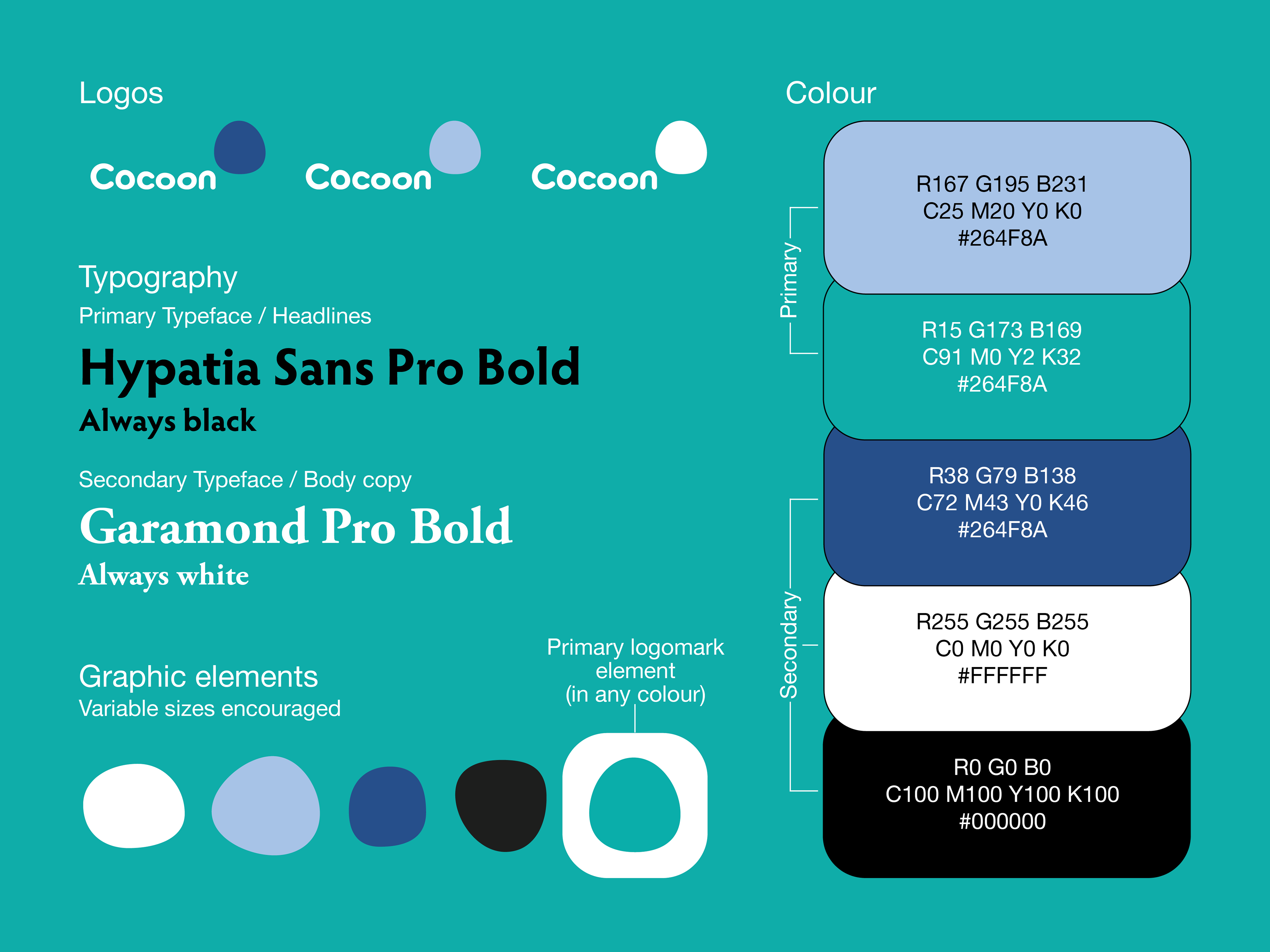
Cocoon
The identity and logo created for this retail space that offers sleep pods, bedding and workshops on meditation and improving sleep, conveys the cosiness and warmth of being in bed, with the hand drawn logo mark signifying that closed in, safe space, coupled with a type logo mark that appears squished, reflecting a comfy soft bed that appeals to their target audience of tired, busy City executives.