A range of presentations developed and designed for a variety of clients.
Adhering to brand guidelines where necessary, the clean and clear design of these decks ensures they are as engaging as possible for the target audience and deliver the client’s key messages effectively.

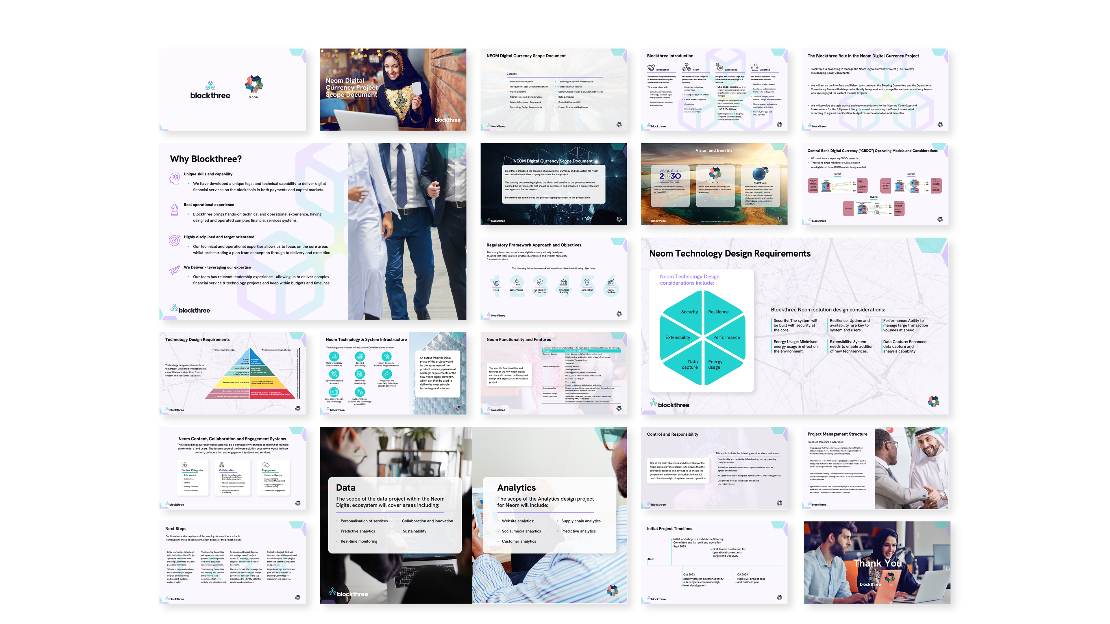
Client: BlockThree
Project: NEOM Coin pitch deck
This pitch deck was designed for leading digital currency and blockchain consultancy BlockThree’s presentation to government representatives in the Middle East, to support their RFP for digital currency infrastructure in new real estate developments.
The deck’s clear design, use of person-centred imagery together with dynamic graphic elements and animations come together to inspire the audience and give them a sense of confidence in BlockThree’s capabilities and expertise.

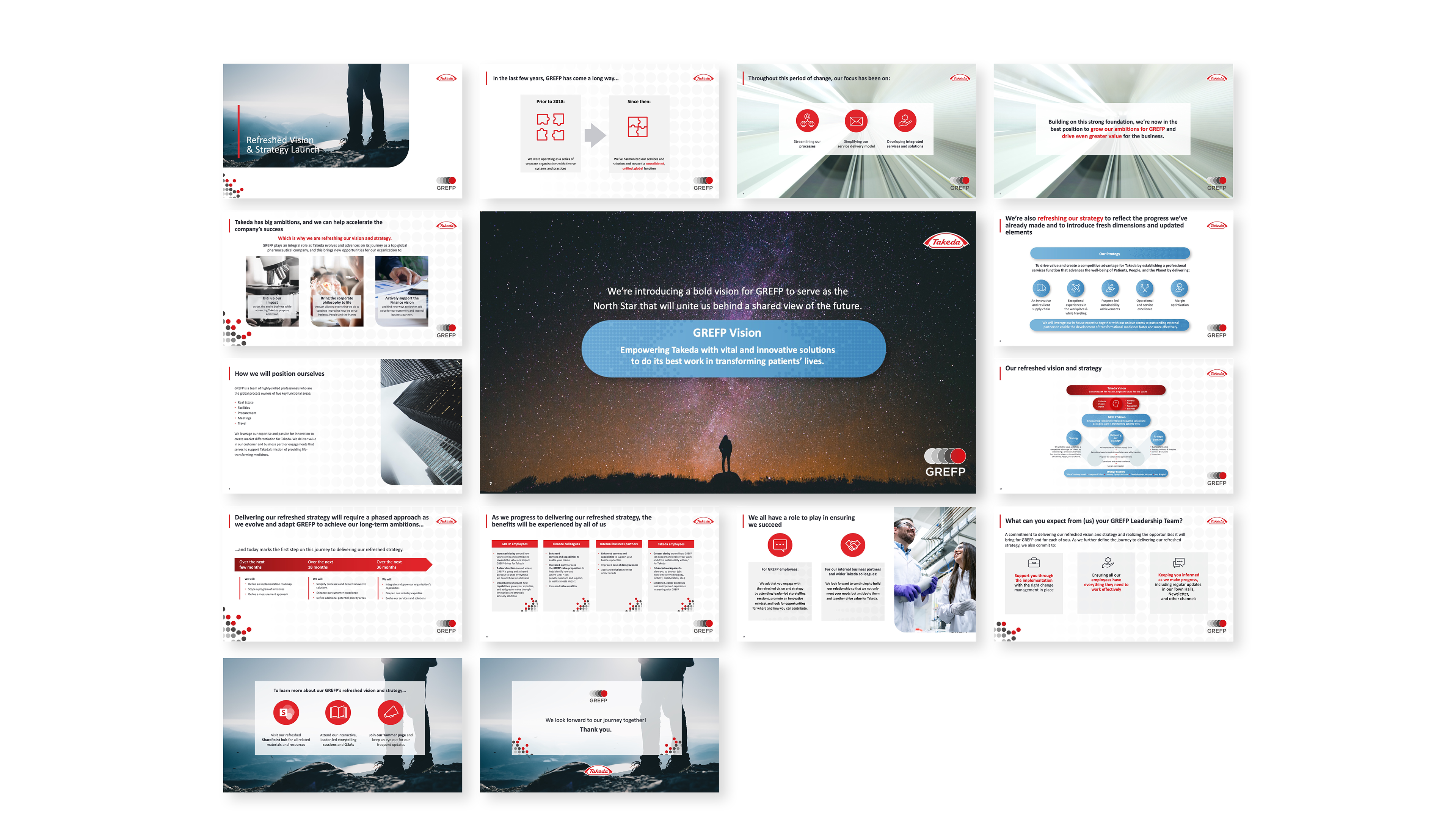
Client: Takeda Pharmaceuticals
Project: GREFP Storytellers Guide deck
This deck was designed and developed as part of the unveiling of a new corporate strategy within Takeda’s GREFP division, providing a workbook for in-house workshops educating staff on the new strategy.
Using powerful and evocative imagery and a clear, uncluttered, step-by-step approach the deck sets out to inspire users and encourage buy-in for the new approach.

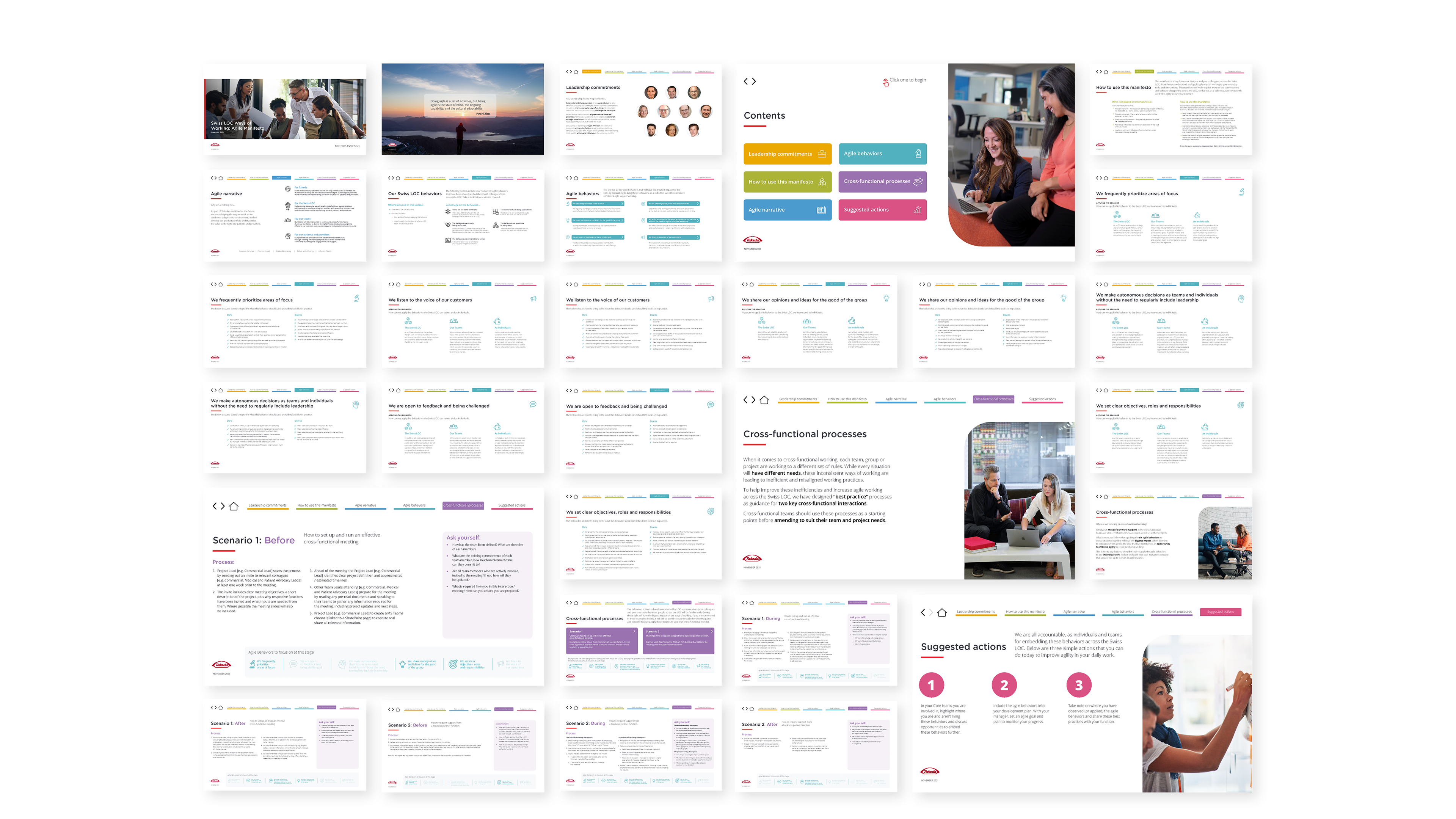
Client: Takeda Pharmaceuticals
Project: Agile Manifesto
This large interactive educational deck was designed to educate and introduce a new Agile way of working to Takeda’s Switzerland-based division. The incorporated navigation elements allow the user to progress through the deck at their own pace and the clear identification of each section through use of the Takeda brand palette, together with, emotive, person-centred imagery and clear layout means the user is engaged and can absorb the information as easily and effectively as possible.

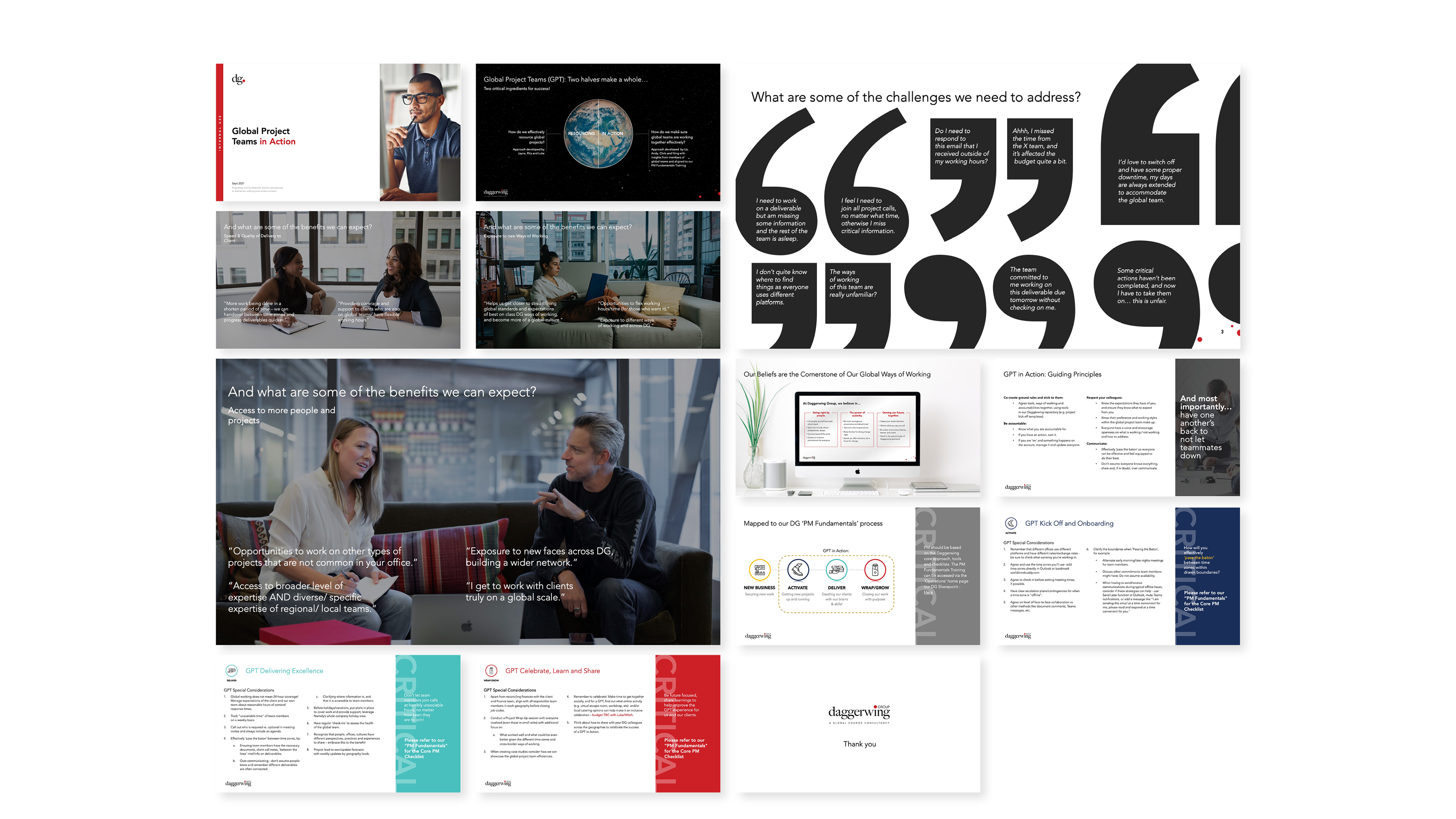
Client: Daggerwing
Project: Global Project Teams
Designed for an internal employee presentation on the organisation’s new initiative, this deck uses bold graphic elements and eye-catching imagery to tie the content together and engage the audience, while still adhering to the business’s brand guidelines.

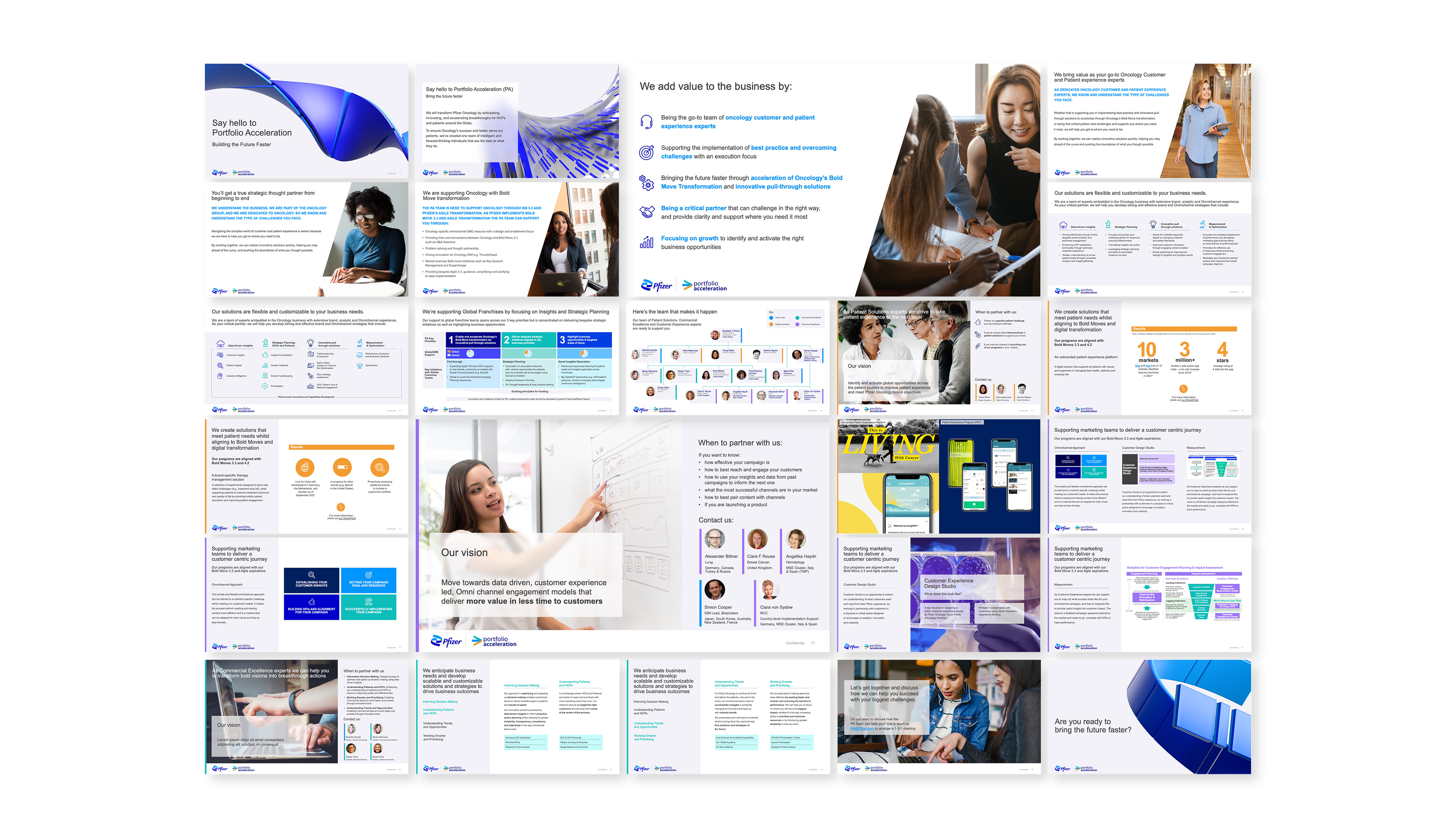
Client: Pfizer
Project: Portfolio Acceleration branding and rollout
This deck was designed to communicate to employees the new Portfolio Acceleration team, their structure and how their work would benefit the business. The deck’s use of Pfizer brand guidelines such as the angled image crop, glass effect text boxes, and people-focused imagery ensures familiarity and buy-in with colleagues for the new team.